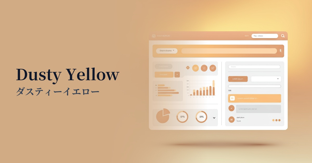
| English name | Dusty Yellow |
|---|---|
| Katakana | Dusty Yellow |
| HEX | #E4D4A4 |
| RGB | 228, 212, 164 |
| Design Theme | Muted colors & earth tones |
Why is it a trend? (Background and reasons)
In recent years, there has been a growing interest in sustainability and coexistence with nature as design trends. Dusty yellow is a type of earth tone that evokes the earth, sand, and dry plants, and is attracting attention as an ideal color for expressing this organic and calming worldview.
Furthermore, in today's world where people spend more time interacting with digital devices, there is a growing preference for color palettes that are easy on the eyes and do not cause user fatigue. Dusty yellow with reduced saturation is highly effective from a UI/UX perspective because it reduces visual stress even during prolonged viewing and provides an environment that makes it easier to concentrate on the content.
This color, which evokes a sense of nostalgia, pairs perfectly with vintage and retro-modern styles. It's not simply old; it allows for a "new yet old" expression, adding a modern sophistication and giving the brand depth and a sense of storytelling.
The psychological effects of design and UX
Dusty yellow tones down the brightness and vibrancy of yellow, bringing a sense of calm and stability. It provides users with a sense of security and is suitable for content and services where reliability is required.
The muted tones create an elegant and sophisticated impression without being flashy. The exquisite balance between a sense of luxury and approachability is what makes it so appealing to a wide range of users.
In UI/UX design, the calming nature of this color helps reduce the cognitive load on the user. Because it is less stimulating, it does not overwhelm users even on screens with a lot of information, and can encourage immersion in the content.
Visibility testing (UI component example)
Practical usage (best practices)
Using it as a background color across a wide area brings a consistent and calm atmosphere to the entire site. It's ideal for blogs and portfolio sites because it enhances content without being overwhelming. Adding dark text ensures readability.
In dark theme designs, using this color as an accent color for buttons, links, and icons can elegantly make elements stand out. Because it's not a strong color, it naturally guides users to important actions without overly drawing their attention.
By partially using it as a background color for card-type UIs or sections, you can gently distinguish information blocks and create a visual hierarchy. It creates a rhythmic and organized impression within a minimalist design.
This approach is highly effective when you want to convey a natural and sophisticated worldview, such as for organic products, craftsmanship-focused brands, or lifestyle media. When combined with photography and typography, it richly expresses the brand's story.
Recommended color scheme suggestions
Charcoal (#36454F)
When combined with charcoal gray, the warmth and elegance of dusty yellow are highlighted. The modern and sophisticated impression, along with the highly visible contrast, makes it ideal for websites where trustworthiness is essential.
Sage Green (#9CAF88)
By combining it with sage green, which belongs to the same earth tone family, you can create a very natural and calming atmosphere. It expresses a comfortable and harmonious worldview on the websites of organic product and lifestyle brands.
Terracotta (#E2725B)
Adding warm terracotta accents brings vibrancy and depth to the overall design. This color scheme is effective when you want to create an energetic impression while still using earth tones.