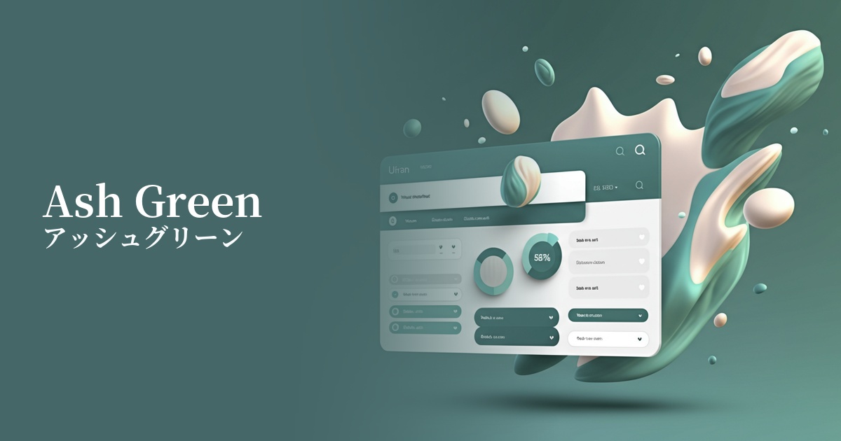
| English name | Ash Green |
|---|---|
| Katakana | Ash Green |
| HEX | #A3B1A8 |
| RGB | 163, 177, 168 |
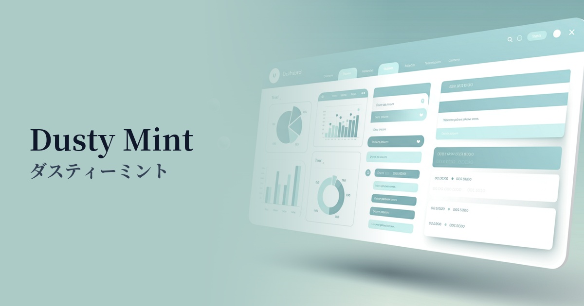
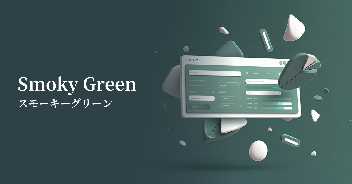
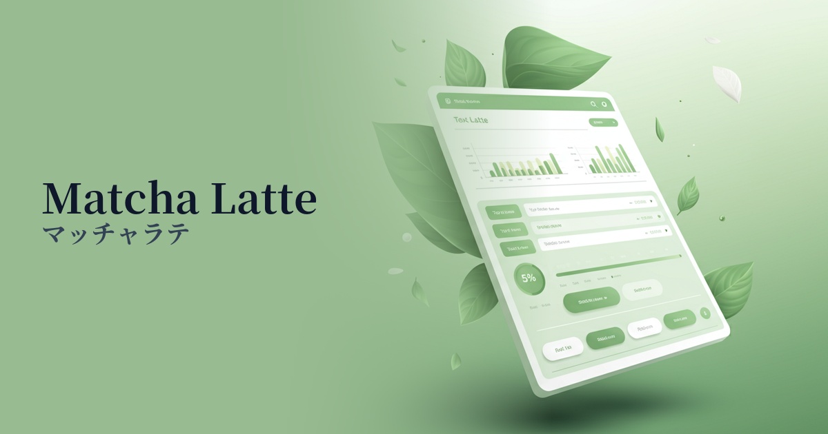
| Design Theme | Muted colors & earth tones |
Why is it a trend? (Background and reasons)
At the heart of recent design trends lies a growing interest in sustainability and wellness. Earth tones, such as ash green, which evoke nature, bring tranquility and calmness to the digital space, providing users with a pleasant experience. In today's information-saturated world, it's only natural that such gentle colors are in demand.
Minimalism has evolved, and now emphasizes not just simplicity, but also warmth, texture, and a human touch. Ash green is characterized by its grayish, muted tone, and its subdued vibrancy gives it a sophisticated impression. It has a definite presence without being overly assertive, adding depth and dimension to modern minimalist designs.
The fusion of technology and nature is one of the reasons this color is popular. By incorporating ash green into interfaces that can easily appear impersonal, such as advanced SaaS dashboards and AI-powered services, it is possible to create a sense of familiarity and trust among users, making technology feel more accessible.
The psychological effects of design and UX
Ash green is a color that evokes forests and plants, and it brings psychological effects such as "peace," "calmness," and "harmony" to users. In websites and applications that are expected to be used for long periods of time, it helps reduce visual fatigue and maintain a relaxed state.
This low-saturation, gray-tinged color conveys an impression of sophistication, elegance, and intelligence. While not flashy, it's highly effective in creating a quiet, high-quality aesthetic. It's an ideal color for subtly conveying a brand's reliability and integrity to users.
From a UI/UX perspective, ash green functions as an excellent background and base color. Its neutral and understated nature means it doesn't detract from the main content or important information (text and images); rather, it enhances them. It creates an environment where users can naturally focus on the content.
Visibility testing (UI component example)
Practical usage (best practices)
Using this color as the background for the entire site or specific sections easily creates a consistent and calming aesthetic. It's particularly effective for conveying the brand's worldview on lifestyle brands and wellness-related service websites. Another advantage is that it provides relatively good contrast with white text, minimizing the risk of compromising readability.
It excels not only as a main color but also as an accent color. For example, using ash green for buttons, links, and icons in a design based on white or beige can subtly attract the user's attention and create elegant navigation.
This background color is ideal for card-style UIs and panels that organize and display information. Even on screens with multiple information blocks, using ash green as a background visually unifies each piece of content, creating a clean and organized impression. It also pairs perfectly with white whitespace.
It's also recommended for dashboards of B2B SaaS and analytics tools. It's expected to reduce eye strain for users who spend long hours looking at screens, and its intelligent and trustworthy appearance enhances the professionalism of the service. It can also be used as a base color for data visualizations.
Recommended color scheme suggestions
Antique White (#FAEBD7)
The tranquility of ash green, combined with the soft warmth of antique white, creates a very comfortable and natural space. This gentle and reassuring color scheme is perfect for organic product and lifestyle websites.
Charcoal (#36454F)
When combined with dark charcoal gray, the sophisticated aspects of ash green are highlighted. This creates a modern and intellectual impression, and also improves readability, making it effective for conveying trustworthiness on portfolio websites and B2B services.
Rosy Brown (#BC8F8F)
By combining the quiet tones of ash green with the reddish warmth of rosy brown, this creates a sophisticated yet human and unique impression. It's suitable for expressing a slightly individualistic worldview in fashion, interior design, and other areas.