| English name | Fade Blue |
|---|---|
| Katakana | Fade Blue |
| HEX | #B0C4DE |
| RGB | 176, 196, 222 |
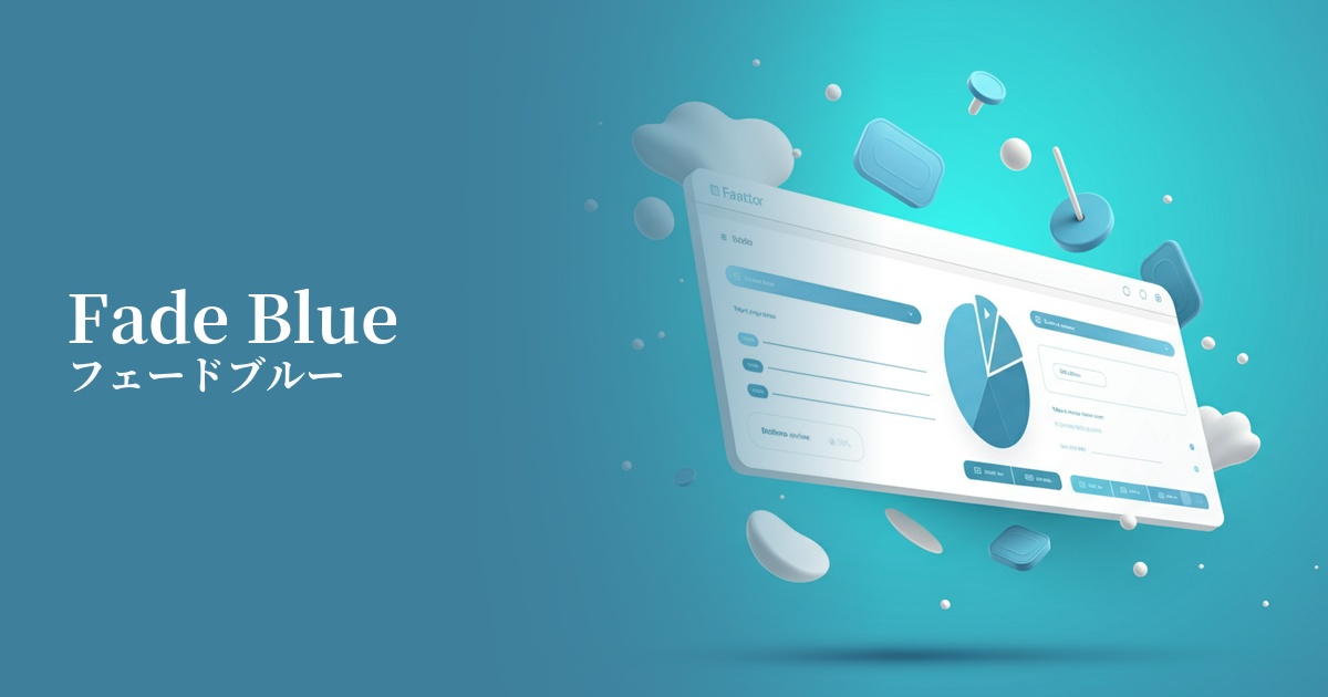
| Design Theme | Muted colors & earth tones |
Why is it a trend? (Background and reasons)
In recent years, with the growing interest in digital detox and mindfulness, users are increasingly seeking calming and soothing colors in web design rather than stimulating ones. Fade blue, with its subdued hue, provides users with a sense of security and is gaining attention as a color that meets this demand.
The trend towards muted colors and earth tones is a major reason why faded blue is gaining popularity. It gives a sophisticated impression without being overpowering, making it very effective for minimalist designs where you want the content to be the main focus, or when you want to highlight other elements.
This color evokes images of nature, such as the sky and water, while also possessing a somewhat digital and clean feel. Therefore, it has a strong affinity with brands that focus on sustainability and wellness, as well as services that deal with cutting-edge technology.
The psychological effects of design and UX
Fade blue conveys the psychological effects of blue, such as "trust" and "sincerity," in a gentler way. It is particularly effective in fields such as finance, healthcare, and B2B SaaS, as it gives users a sense of security and increases their trust in the site or service.
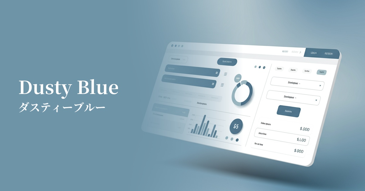
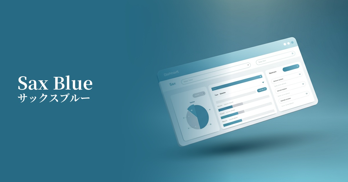
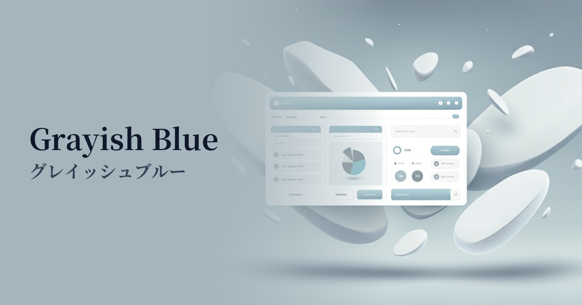
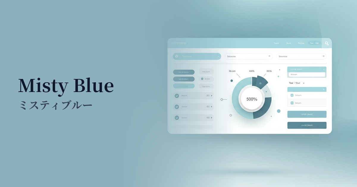
Because it conveys an intelligent and calm impression, it is suitable for the UI of dashboards and analytical tools that handle complex information. It contributes to creating an environment where users can calmly organize information and concentrate on their tasks.
The bright, light colors bring a sense of openness to the screen. Combined with a clean layout that makes good use of white space, it creates a modern, airy, and sophisticated user experience.
Because of its low saturation, care must be taken with the contrast with text colors. Especially when used as a background color, it is important to combine it with dark text colors that provide sufficient contrast, such as dark gray or navy, in order to meet WCAG accessibility standards.
Visibility testing (UI component example)
Practical usage (best practices)
By using it as the background color for the entire site or for specific content sections, you can easily create a calm and unified aesthetic. It's especially recommended for minimalist portfolio sites and wellness service websites.
When used in the UI of SaaS applications, such as in headers, sidebars, and inactive tabs, it creates an eye-friendly interface that is less tiring for users to use for extended periods.
Within a clean design that uses white and light gray as the main colors, it is used as an accent for interactive elements such as CTA buttons, links, and icons. It plays a subtle yet effective role in prompting user action.
Setting this color as the background color for card-type components used in service introductions or blog post lists visually groups the information, improving the overall readability of the content.
Recommended color scheme suggestions
Navajo White (#FFDEAD)
When combined with warm off-white tones, it creates a natural and approachable impression. The coolness of faded blue is enhanced with a human warmth, making it ideal for lifestyle brands and similar businesses.
Charcoal (#36454F)
Using dark charcoal gray for text and important UI elements ensures high readability while creating an intelligent, sophisticated, and modern atmosphere. This combination is suitable for business websites and SaaS applications where reliability is paramount.
Coral (#FF7F50)
Adding a vibrant coral accent brings energy and positive vibes to the overall design. The beautiful contrast with the tranquility of the faded blue attracts the user's attention and is particularly effective for CTA buttons.