| English name | Protocol Green |
|---|---|
| Katakana | Protocol Green |
| HEX | #03F984 |
| RGB | 3, 249, 132 |
| Design Theme | Neon & Cyberpunk Colors |
Why is it a trend? (Background and reasons)
Protocol green has emerged as a web design trend, driven by technological advancements and growing interest in the digital age. It's particularly being used in many cutting-edge projects to visually represent futuristic concepts such as AI, the metaverse, and blockchain.
This color trend is deeply connected to nostalgia for the cyberpunk and retro-futuristic worlds depicted in the 80s and 90s. Its unique atmosphere, which is digital yet somehow nostalgic, is stimulating the sensibilities of contemporary creators.
Furthermore, the widespread adoption of dark mode has also boosted the popularity of protocol green. This color glows very brightly against a dark background, creating visual contrast. This makes it possible to attract the user's attention and effectively highlight important elements of the UI.
The psychological effects of design and UX
Protocol Green evokes keywords such as innovation, technology, the future, and energy. Its vibrant glow gives viewers an active and dynamic impression, inspiring a sense of anticipation for something new to begin.
In UI/UX design, this color has a powerful attention-grabbing effect. By using it in CTA buttons, notifications, and indicators showing active status, you can naturally guide the user's gaze and encourage the next action.
On the other hand, because it is a highly saturated and stimulating color, overuse can cause visual fatigue in users. From an accessibility standpoint, it is necessary to ensure sufficient contrast with the background color and pay close attention to readability, especially when using it in text.
Visibility testing (UI component example)
Practical usage (best practices)
The most effective use is as an accent color. Limiting its application to an area of approximately 2-51 TP3T across the entire site, and using it on buttons, icons, links, and loading animations, can tighten the overall design and create a sophisticated, futuristic feel.
It's also recommended to partially incorporate it into the headline typography and key graphics in the hero area, which determines the first impression of your website. You can instantly capture the user's attention and strongly leave a lasting impression of your brand's cutting-edge image.
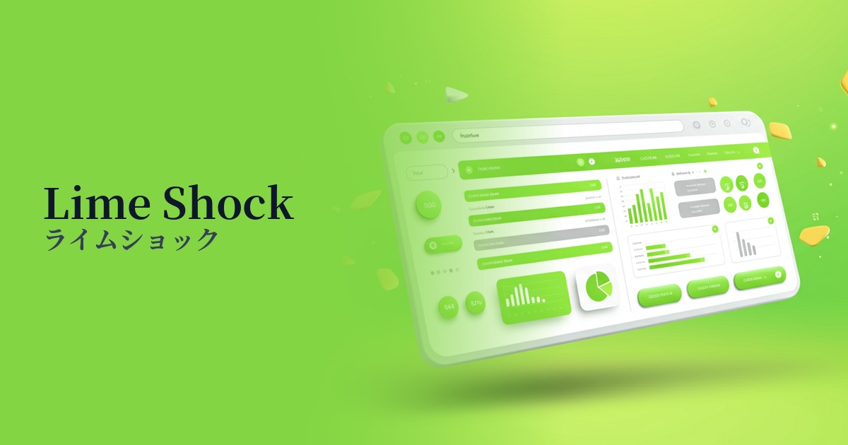
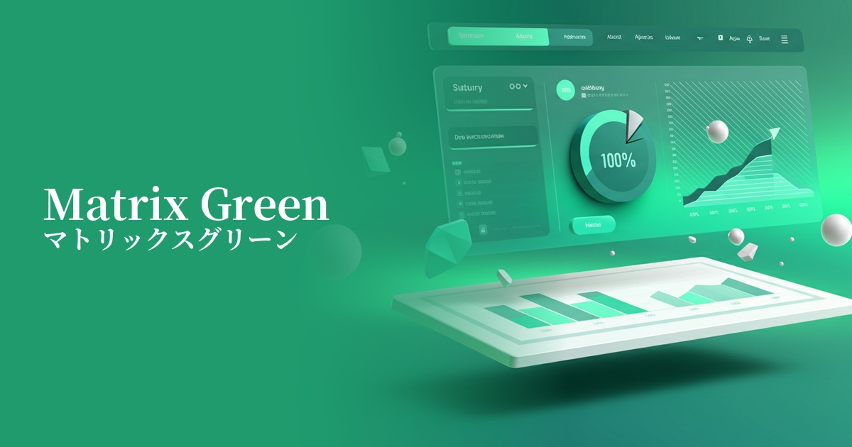
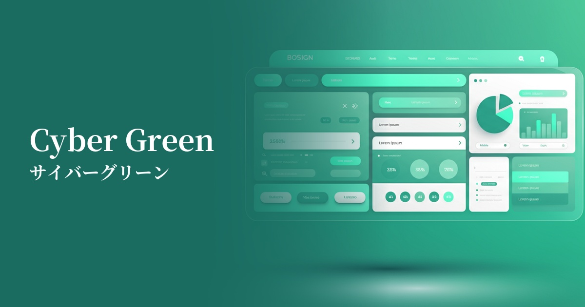
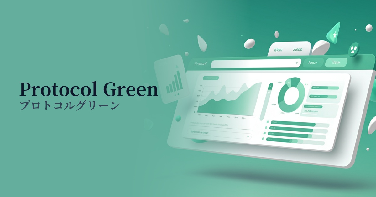
This is also effective in SaaS dashboards and data visualizations. By using this color to highlight specific values in graphs and charts, you can intuitively convey the importance of the information. However, be careful not to overwhelm the system by considering the balance with other colors.
Using it as the entire background is usually too intense and should be avoided. If you want to incorporate it into a background, a more practical approach would be to use it as part of a gradient to black or dark blue, or to place it subtly as an element of a geometric pattern.
Recommended color scheme suggestions
Raven (#212121)
Protocol green stands out vividly against a dark background, making it the most effective way to express a cyberpunk or futuristic worldview. It's a classic combination, offering high visibility and perfect for highlighting important information.
Viola (#8F00FF)
Green and purple complement each other, creating a digital and fantastical atmosphere. This combination is especially recommended for those who want a retro-futuristic design reminiscent of 80s synthwave.
Gainsboro (#DCDCDC)
By combining it with a light gray, the intense impression of protocol green is softened, creating a clean, modern, and technologically sophisticated feel. It's perfect for when you want to use it as a refined accent within a minimalist design.