| English name | Vanilla Cream |
|---|---|
| Katakana | Vanilla cream |
| HEX | #F5F3E7 |
| RGB | 245, 243, 231 |
| Design Theme | Neutral & Minimal Background Colors |
Why is it a trend? (Background and reasons)
In recent years, web design has seen a shift from pure white (#FFFFFF) to more eye-friendly and warm off-white tones. Vanilla cream is a prime example of this trend. This trend is driven by users' desire for the "comfort" and "natural feel" of the physical world in the digital space.
The growing interest in values such as sustainability and organic products is one of the reasons why vanilla cream is chosen. This color, reminiscent of unbleached cotton, linen, and smooth ceramics, is highly compatible with the brand's image of promoting an eco-friendly and mindful lifestyle.
Furthermore, it's important from a UX design perspective. Because it reflects light more gently than pure white, it can reduce eye strain even during prolonged viewing. This contributes to providing a user-friendly interface, especially for text-heavy websites and applications that switch between dark and white modes.
The psychological effects of design and UX
As its name suggests, Vanilla Cream evokes the sweet and gentle taste of vanilla, instilling positive emotions in users such as "reassurance," "comfort," and "familiarity." Its non-aggressive and neutral impression helps to disarm users' apprehension and allow them to focus on the content.
It's not just plain "white"; the subtle hint of yellow adds a touch of elegance and high quality. Because it creates a sophisticated atmosphere without being overly ornate, it's useful for building the brand image of luxury cosmetics, fashion, and high-end food brands.
From a UI/UX perspective, this color is an excellent "supporting color." When used as a background color, it makes the main content, photos, and accent colors stand out without interfering with them. It also helps to clarify the hierarchical structure of information and supports users in intuitively understanding the information.
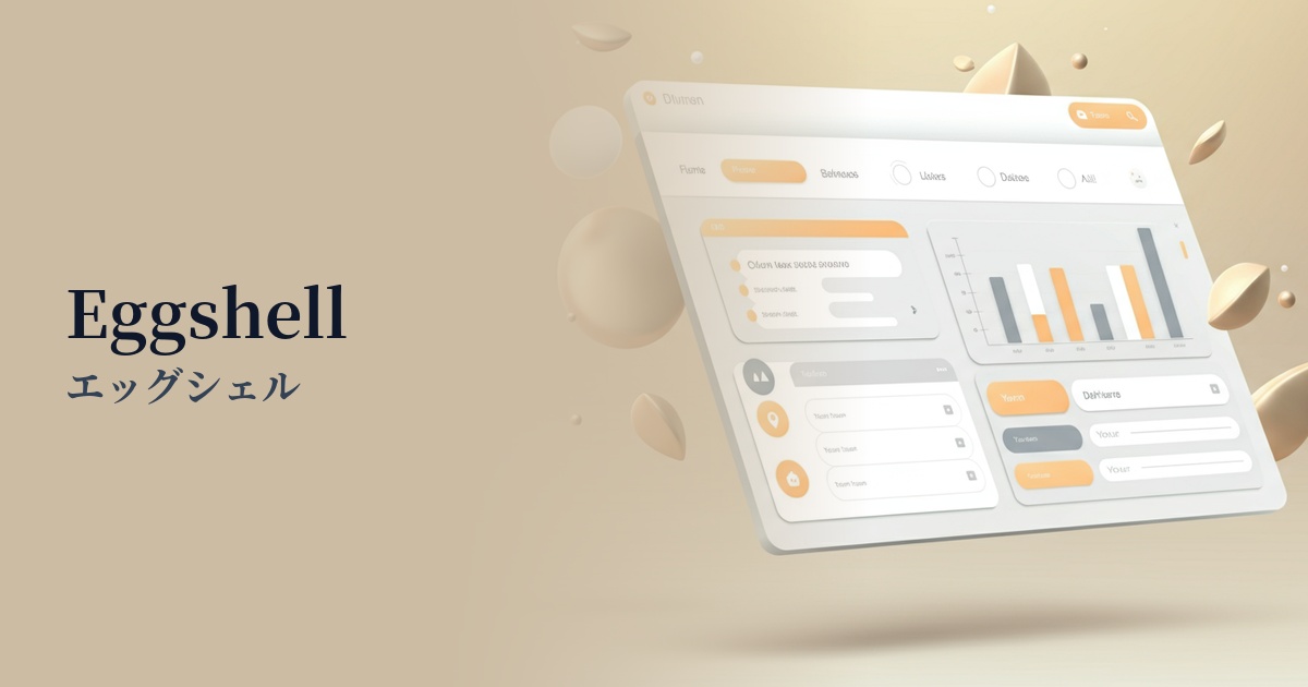
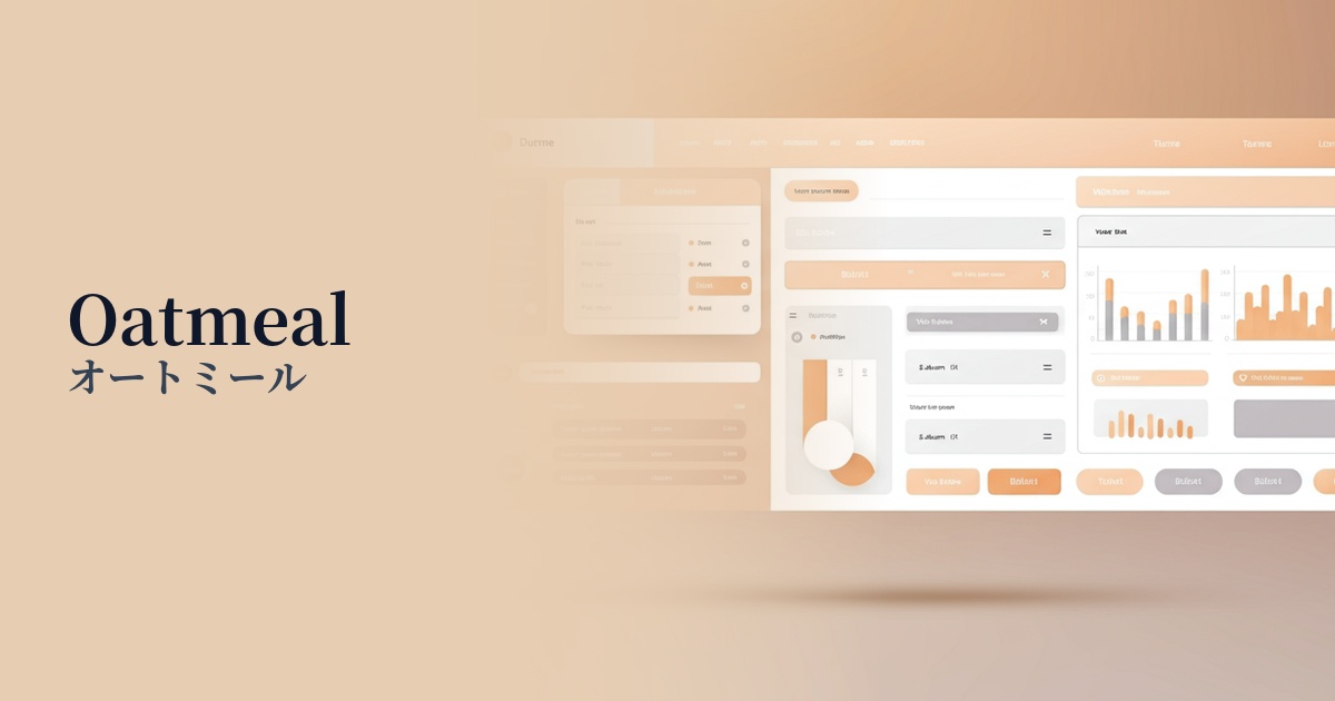
Visibility testing (UI component example)
Practical usage (best practices)
The most effective use is as the background color for the entire website. Applying it to a minimalist layout with plenty of white space makes the content stand out and creates a warm, clean, and unified feel throughout the site.
It's also recommended for use as the background color for product lists on e-commerce sites or card UIs in blog posts. Combining it with other neutral colors (such as light gray or beige) makes it easier to distinguish between information blocks and creates a visual rhythm.
It's also perfectly suited for photographic content. In particular, when combined with portraits shot in natural light or product photos based on earth tones, the overall tone harmonizes, creating a very sophisticated visual.
Another technique is to use it as a partial accent, such as for buttons or the background of specific sections, rather than as the main color. By placing an area of vanilla cream within a dark background, you can gently draw the user's attention to that area.
Recommended color scheme suggestions
Verde Salvia (#87AE73)
The warmth of vanilla cream, combined with the calming, natural hue of sage green, creates an organic and sophisticated impression. This color scheme is ideal for lifestyle brands and wellness websites, instilling a sense of security and trust in users.
Rosy Brown (#BC8F8F)
The softness of vanilla cream combined with the sophisticated muted tone of rosy brown creates an elegant and slightly nostalgic atmosphere. It can be used to express grace and warmth in cosmetics, fashion, and wedding-related designs.
Slate Blue (#6A5ACD)
Adding a clean and trustworthy slate blue accent enhances the approachability of vanilla cream, giving it an impression of sincerity and professionalism. This is effective when you want to balance a sense of security and functionality in SaaS UIs and corporate websites.