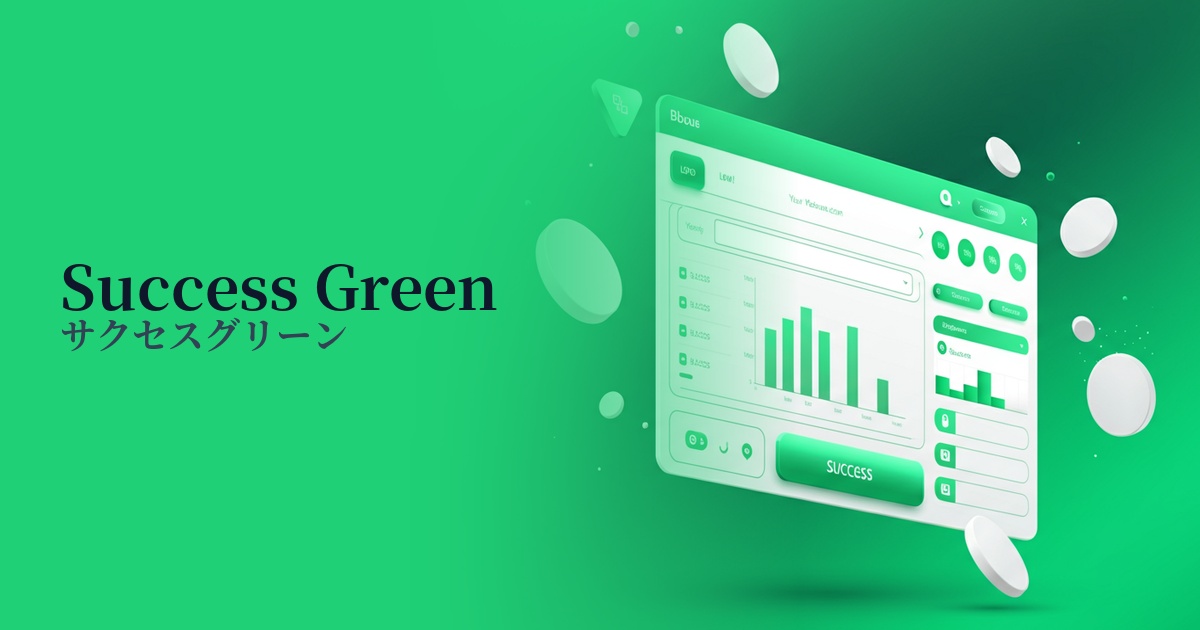
| English name | Success Green |
|---|---|
| Katakana | Success Green |
| HEX | #22C55E |
| RGB | 34, 197, 94 |
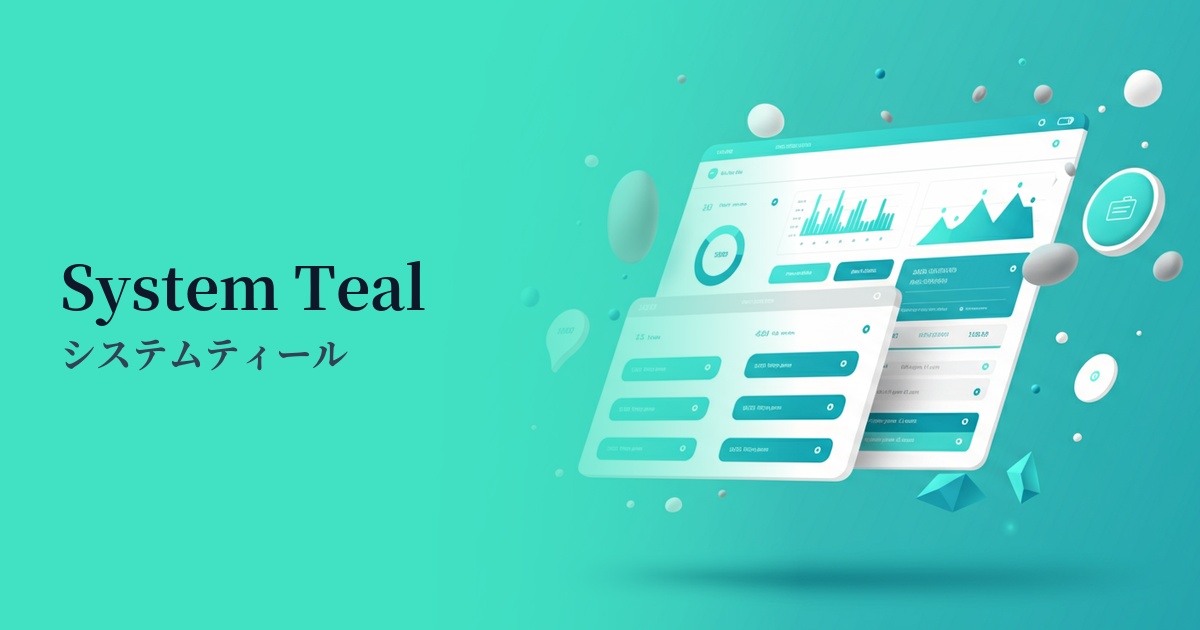
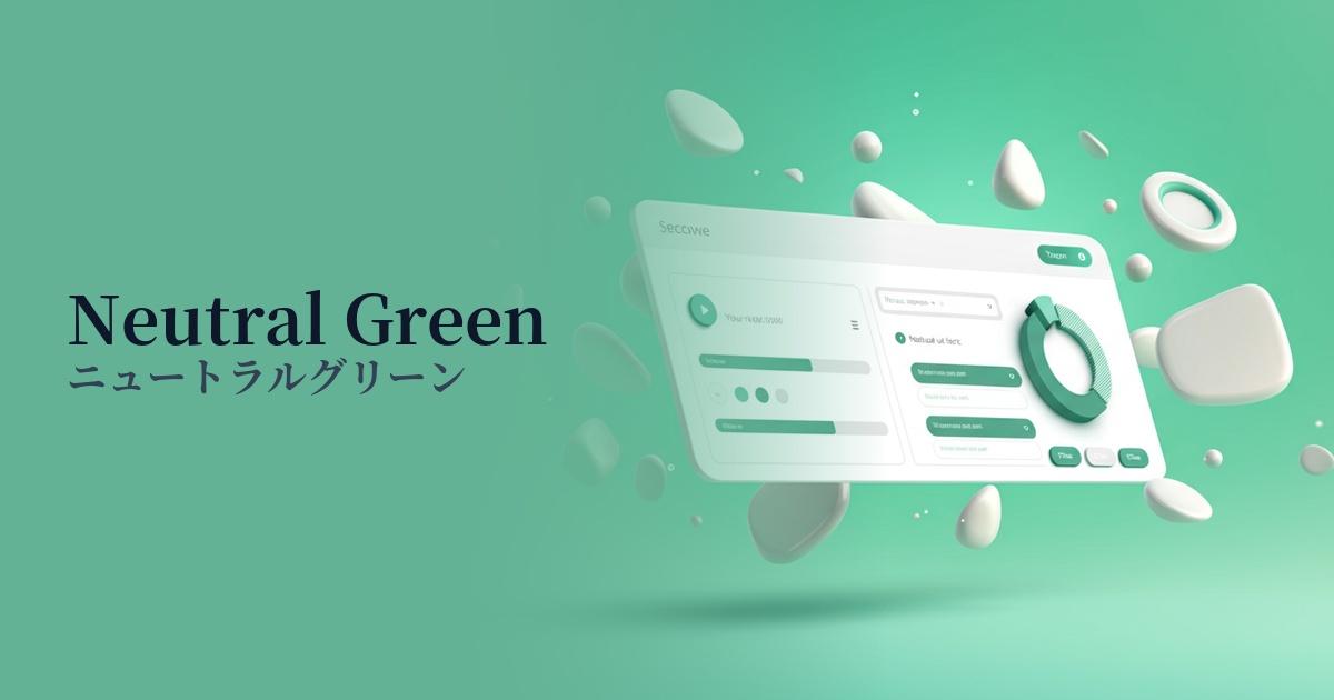
| Design Theme | UI System & Alert Colors |
Why is it a trend? (Background and reasons)
In recent years, web design, especially in the realm of SaaS and web applications, has become extremely important in providing clear feedback to users about the results of their actions. Success Green has become established as a common language for intuitively conveying positive states such as "success," "completion," and "approval," and is adopted as a standard color in many UI kits and design systems.
Furthermore, the growing concern for accessibility is also boosting the role of this color. Its clear contrast with other alert colors such as red (error) and yellow (warning) allows many users, regardless of their color vision, to quickly recognize the system's status. This contributes to creating a more inclusive and user-friendly experience.
From a user engagement perspective, evoking positive emotions upon task completion is highly effective. The sense of accomplishment and reassurance that SuccessGreen provides is a crucial factor in increasing user satisfaction and encouraging trust in the service and continued use.
The psychological effects of design and UX
This color is a powerful symbol of "success" and "completion." Using this color in messages such as "Saved" and "Sent" allows users to instantly understand that their actions have been processed correctly, providing them with a sense of reassurance. This immediate feedback plays a crucial role in reducing the cognitive load on the user.
Green evokes associations with nature and growth, and psychologically conveys positive images such as "safety" and "progress." Like traffic lights, it gives users permission to "continue on this path" and smoothly guides them to the next action.
It is particularly effective in areas where reliability is paramount, such as financial services and e-commerce. By visually demonstrating that payments have been completed and data protection is in place, it can instill in users an unconscious sense of trust that "this service is safe."
Visibility testing (UI component example)
Practical usage (best practices)
This is ideal for success messages and notifications (toasts) after form submission. Displaying text such as "Registration complete" or "Settings saved" clearly communicates that the user's action was successful.
These indicators are used in SaaS dashboards and management screens to show task completion status and server operation status. Using them alongside red and yellow indicators provides a highly visual and intuitive UI.
Using a call to action (CTA) button that directly leads to conversion (e.g., "Confirm Purchase") strongly encourages the user to take their final action. However, it is important to consider harmony with the overall brand colors of the site and clearly define its visual priority compared to other buttons.
By combining colors with icons such as checkmarks (✓), information can be accurately conveyed to users with color vision deficiencies. This is a fundamental practice for improving accessibility.
Recommended color scheme suggestions
Charcoal (#36454F)
Using a muted charcoal color for text and UI elements enhances the vibrancy of Success Green, improving visibility. It creates a modern and trustworthy impression, making it ideal for professional application UIs.
Antique White (#FAEBD7)
By using a warm off-white background, the positive impression of Success Green becomes softer and more approachable. It effectively creates a sense of reassurance within a clean and minimalist layout.
Slate Gray (#708090)
Using Success Green as the primary notification color and Slate Gray as a secondary color for buttons and backgrounds creates a calm and stable color scheme. This also makes it easier to organize the visual hierarchy, even on screens with a lot of information.