| English name | Hand Purple |
|---|---|
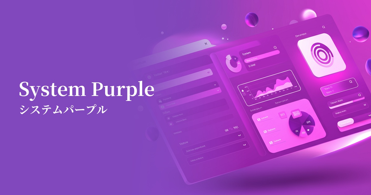
| Katakana | System Purple |
| HEX | #8B5CF6 |
| RGB | 139, 92, 246 |
| Design Theme | UI System & Alert Colors |
Why is it a trend? (Background and reasons)
In recent years, web design has seen a shift towards building "design systems" composed of reusable and consistent UI components. System purple is highly functional as a color to indicate "major actions" or "active states" within such systems. Its vibrant yet eye-friendly hue effectively communicates important elements to the user, even in complex interfaces.
This color is strongly associated with modern values such as technology and innovation. It stands apart from the stable blue often used in traditional corporate colors, creating a more advanced and creative brand image. SaaS platforms and startups are actively adopting it to project a modern and forward-thinking image.
From a user experience (UX) perspective, system purple strikes a perfect balance. Because it's not as strong a warning color as red or orange, it can draw users' attention to clickable buttons and important notifications without causing unnecessary alarm. As a color that encourages positive action, it also contributes to improved conversion rates.
The psychological effects of design and UX
Purple has long been a color that symbolizes nobility, creativity, and mystery. In web design, system purple gives users an impression of "innovation" and "futurism," intuitively conveying the cutting edge of a service. It is particularly well-suited for sites dealing with creative tools and cutting-edge technologies.
This particular shade, a bluish-purple, combines the originality of purple with the reliability and stability of blue. This makes users feel more comfortable using the service. It's effective in demonstrating that the service is not just new, but trustworthy.
Highly saturated and vibrant colors have the effect of naturally guiding the user's gaze. They act as a guide, clearly indicating where to focus on the interface and what to do next, improving the overall usability of the site.
Visibility testing (UI component example)
Practical usage (best practices)
It's ideal for key CTA (Call To Action) buttons that directly lead to conversions, such as "Register" or "Purchase." It stands out against a neutral background, clearly indicating the most important action the user should take.
By using it on the active item in the navigation menu, the selected tab, and the borders of form fields being filled in, it provides users with visual feedback on "where they are now" and "what they have selected," increasing their confidence in their actions.
In SaaS dashboards and analytics tools, using this color to highlight important data series in graphs and charts makes the information stand out. It clearly distinguishes them from other data, helping users quickly grasp the numbers.
By consistently using it as an accent color throughout the entire site—in icons, heading underlines, and as a contrasting color in illustrations—you can build a sophisticated and modern brand image.
Recommended color scheme suggestions
Gainsboro (#DCDCDC)
When combined with the light gray of Gainsboro, it creates a clean and minimalist impression. The vibrancy of System Purple stands out, making it ideal for building a highly readable, modern UI. Recommended for professional SaaS and portfolio sites.
Marigold (#FFC30B)
Adding Marigold, a color that is close to its complementary color, as an accent creates an energetic and playful color scheme. This is effective when you want to strongly attract the user's attention or create a lively impression on a landing page for a creative service.
Midnight Blue (#191970)
By using a deep Midnight Blue as a base and incorporating System Purple, a sophisticated dark mode UI is created that blends luxury and technology. It is suitable for cyberpunk-themed environments and interfaces for advanced financial and data-related services.