| English name | Dark Purple |
|---|---|
| Katakana | Dark Purple |
| HEX | #6D28D9 |
| RGB | 109, 40, 217 |
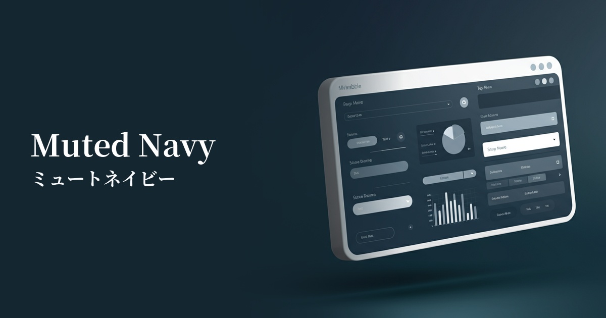
| Design Theme | UI System & Alert Colors |
Why is it a trend? (Background and reasons)
With the rise of dark mode, there's a growing demand for deep colors other than black and dark gray as background colors. Dark purple, with its rich and sophisticated appearance, is gaining popularity among designers who want to add personality and a touch of luxury to their dark UIs.
Furthermore, it is recognized as a color that symbolizes the evolution of digital technology. Services and brands that deal with cutting-edge themes such as AI, the metaverse, and cybersecurity tend to choose dark purple as the perfect color to express their worldview, as it gives off a mysterious and intellectual impression.
In addition, the resurgence of interest in Y2K fashion and cyberpunk culture, particularly among Generation Z, is another reason why this color is gaining attention. Dark purple, with its somewhat nostalgic yet futuristic feel, harmonizes beautifully with contemporary design trends.
The psychological effects of design and UX
Dark purple adds depth and tranquility to the color purple, which has long been considered a symbol of nobility and mystery. This gives websites and apps an impression of sophistication, expertise, and intelligence. Users will intuitively perceive it as a trustworthy and high-quality service.
From a UI/UX perspective, this color is expected to enhance user concentration. In particular, using it as a background color or for key components in interfaces where users are engrossed in a task, such as data analysis tools or creative software, can help prevent distractions and improve productivity.
Dark purple is also said to be a color that stimulates creativity and inspiration. Using it on portfolio sites for creators or collaboration tools for generating new ideas can have a psychological effect that encourages users' creative thinking.
Visibility testing (UI component example)
Practical usage (best practices)
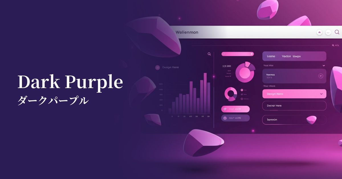
This color is ideal as the main color for dashboards of SaaS products and analytics tools. When used as a background color in dark mode, it makes charts, graphs, and important KPIs stand out, creating a clear visual hierarchy. It can also help reduce eye strain during prolonged use.
On landing pages (LPs), using a CTA (Call To Action) button as the main element can powerfully encourage user action. In particular, placing it against a white or light gray background ensures high contrast and visibility, contributing to a higher click-through rate.
It can also be effectively used as an accent color. For example, in a minimalist, white-based design, using dark purple sparingly for the active state of navigation, icons, and link text can effectively convey important elements to the user while maintaining a sophisticated impression.
In branding, it is particularly effective as a key color for cutting-edge technology companies and brands offering premium services. Using it in logos and key visuals can build an innovative and trustworthy brand image.
Recommended color scheme suggestions
Gainsboro (#DCDCDC)
The bright and clean Gainsboro softens the heavy feel of dark purple, creating a modern and sophisticated impression. Its high readability makes it ideal for designs where trustworthiness is essential, such as corporate websites and SaaS UIs.
Spring Green (#00FF7F)
The combination of dark purple and vibrant spring green evokes a cyberpunk or futuristic world. The strong contrast attracts attention and is effective for gaming and entertainment websites, as well as landing pages that want to showcase cutting-edge technology.
Gold (#FFD700)
The combination of a noble dark purple with a glamorous and rich gold creates a supremely luxurious feel. It is particularly effective when used on premium brand websites or exclusive member pages.